Are you looking to visually represent valuation ranges for a company in a clear and concise way? This guide provides a detailed explanation of How To Make A Football Field chart, a powerful tool for investment banking valuation analysis, using both Excel and specialized tools like Macabacus. CAUHOI2025.UK.COM is here to provide you with reliable information and practical solutions.
1. Understanding the Football Field Chart
A football field chart, also known as a range chart, is a graphical representation that displays various valuation ranges for a company. Each valuation method is represented as a horizontal bar, resembling the yard lines on a football field. This chart facilitates a quick visual comparison of different valuation methodologies and helps identify any outliers.
The typical football field chart showcases:
- The minimum and maximum values of each valuation range.
- The midpoint of each range.
- The average valuation across all methods.
This visual representation helps viewers grasp the entire spectrum of valuations and spot any anomalies quickly.
 Prepare Your Data for Charting
2. Why Choose a Football Field Chart?
Football field charts offer several key advantages in financial analysis:
- Visual Comparison: Instead of sifting through numerical tables, a football field chart presents valuation ranges in a graphical format, allowing for quick and easy comparison.
- Outlier Detection: It becomes immediately apparent when one valuation range deviates significantly from the others, prompting further investigation into the underlying assumptions.
- Summary Statistics: The chart clearly displays the average and midpoints of the ranges, providing valuable summary statistics at a glance.
- Clean Presentation: The data is presented in a clean and uncluttered manner, avoiding excessive numbers and text.
- Flexibility: The chart can accommodate a wide range of valuation methodologies, from a few to over ten.
These benefits make the football field chart a popular choice for investment bankers to communicate valuations effectively in presentations and models.
3. Creating a Football Field Chart in Excel: A Step-by-Step Guide
Here’s a detailed guide on how to create a football field chart manually in Excel:
3.1. Data Organization
Begin by organizing your data in three columns:
- Valuation Method: Name of the method used (e.g., Discounted Cash Flow, Precedent Transactions).
- Minimum (Low) Value: The lowest valuation derived from the method.
- Maximum (High) Value: The highest valuation derived from the method.
Your data should resemble the following:
| Valuation Method | Minimum Value (USD) | Maximum Value (USD) |
|---|---|---|
| Discounted Cash Flow | 50 | 70 |
| Precedent Transactions | 45 | 65 |
| Comparable Companies | 55 | 75 |
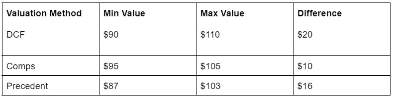
3.2. Data Preparation
To prepare the data for a stacked column chart, add a fourth column titled Difference. This column calculates the difference between the maximum and minimum values. The formula for the first row would be =C2-B2.
The updated data table should look like this:
| Valuation Method | Minimum Value (USD) | Maximum Value (USD) | Difference (USD) |
|---|---|---|---|
| Discounted Cash Flow | 50 | 70 | 20 |
| Precedent Transactions | 45 | 65 | 20 |
| Comparable Companies | 55 | 75 | 20 |
3.3. Creating the Stacked Column Chart
- Highlight Data: Select the data, excluding the Valuation Method column.
- Insert Chart: Go to Insert > Column or Bar Chart > Stacked Column.
This will create a basic stacked column chart.
3.4. Formatting the Chart
- Select Minimum Value Series: Click on the chart, then select the data series representing the Minimum value.
- Format Data Series: Right-click and choose Format Data Series.
- No Fill: Under the Fill option, select No Fill. This makes the Minimum value invisible, leaving only the Difference visible, creating the football field chart effect.
3.5. Final Touches
- Remove Clutter: Delete any unnecessary legends, gridlines, or labels.
- Add Data Labels: Add data labels to show the exact range of each valuation method. Consider adding both minimum and maximum labels for clarity.
- Adjust Aesthetics: Adjust column width, colors, and fonts to match your desired style.
3.6. Axis Adjustments
- Vertical Axis: Ensure the vertical axis (Valuation Methods) lists the methods in the desired order.
- Horizontal Axis: Adjust the horizontal axis to cover the full range of values being represented.
Creating a football field chart in Excel manually requires some effort, but the result is a clean, professional visualization of valuation ranges. With practice, this process becomes more efficient, making it a valuable skill for finance professionals.
4. Building a Football Field Chart with Macabacus
For a streamlined approach, consider using tools like Macabacus, which offer built-in templates for creating football field charts. Here’s how:
- Input Data: Organize your valuation data with columns for valuation methodology, minimum value, and maximum value.
- Select Data: Highlight the input data to feed the football field chart.
- Insert Chart: Go to CHARTS > Quick Charts > Football Field.
- Configure Settings: Select your data in the dialog box and adjust size, colors, and data labels.
- Refine Formatting: Tweak fonts, number formats, and column widths to polish the chart’s appearance.
Macabacus simplifies the process and provides more formatting options, saving time and effort.
5. Visual Elements Enhancing Football Field Charts
In addition to the basic construction of a football field chart, several visual enhancements can significantly improve its clarity and impact.
5.1. Color Coding
Implement a color scheme that differentiates valuation methods. For instance, use shades of blue for discounted cash flow analyses, shades of green for precedent transactions, and shades of gray for market multiples. Consistent color-coding allows viewers to quickly associate colors with valuation types, enhancing visual processing. According to a study by the University of California, Berkeley, effective use of color in visualizations can increase comprehension by up to 85%.
5.2. Data Labels and Annotations
Clearly label each valuation range with its minimum and maximum values. Annotations can highlight specific observations, such as outliers or critical valuation benchmarks. Ensure labels are legible and do not clutter the chart. A study from Stanford University’s Visualization Group emphasized that clear labeling improves data recall by approximately 30%.
5.3. Statistical Lines
Incorporate statistical lines such as the average or median valuation across all methods. These lines provide immediate reference points, allowing viewers to quickly gauge whether individual valuations are above or below the overall trend. Dotted or dashed lines can differentiate these statistical measures from the solid bars representing valuation ranges.
5.4. Interactive Elements
In digital presentations, consider interactive elements such as tooltips that appear when hovering over a valuation range, providing detailed information about the methodology and assumptions used. This provides deeper insights without overwhelming the primary chart.
5.5. Clear Axis Labels
Ensure that both the horizontal and vertical axes are clearly labeled. The horizontal axis should indicate the valuation in monetary units (e.g., USD millions), while the vertical axis should list the valuation methods. Use a font size that is large enough to be easily readable but does not dominate the visual elements.
5.6. Consistent Spacing
Maintain consistent spacing between valuation ranges to avoid visual clutter. Ensure that the bars representing the ranges are of uniform width unless there is a specific reason to vary them (e.g., weighting by relevance). Proper spacing enhances the chart’s readability and aesthetic appeal.
5.7. Visual Hierarchy
Emphasize the most critical information through visual hierarchy. For example, you might make the bars representing the primary valuation methods slightly bolder or use a brighter color. This helps viewers focus on the most important aspects of the analysis.
5.8. Use of Icons
Add icons next to each valuation method to provide a quick visual cue. For instance, a cash flow icon for discounted cash flow, a handshake icon for precedent transactions, and a building icon for comparable companies. Icons enhance visual appeal and aid in quick recognition.
5.9. Background and Gridlines
Choose a clean and non-distracting background. Subtle gridlines can help viewers align the valuation ranges with the horizontal axis but should not overshadow the primary data. A minimalist background ensures that the focus remains on the valuation ranges.
5.10. Animations and Transitions
When presenting the chart, use subtle animations and transitions to guide the audience through the information. For example, you might reveal each valuation range sequentially, highlighting the key insights as you go. Animations should be smooth and purposeful, not distracting.
6. Key Elements to Include in Your Football Field Chart
6.1 Valuation Methodologies
Detail various methodologies like Discounted Cash Flow (DCF), Precedent Transactions, Comparable Companies, and Leveraged Buyout (LBO) analysis.
6.2 Range of Values
Depict the low and high values derived from each methodology to provide a comprehensive valuation range.
6.3 Average Valuation
Compute and display the average valuation across all methodologies to offer a central tendency measure.
6.4 Median Valuation
Include the median valuation, which is less sensitive to outliers, providing a more robust central measure.
6.5 Current Market Price
Mark the current market price on the chart to evaluate if the company is undervalued or overvalued.
6.6 Sensitivity Analysis
Incorporate sensitivity analysis to show how different assumptions affect valuation ranges.
6.7 Implied Multiples
Present key implied multiples from the valuation, such as Price-to-Earnings (P/E) or Enterprise Value to EBITDA (EV/EBITDA).
6.8 Peer Group Comparison
Illustrate how the company’s valuation compares to its peer group, highlighting relative positioning.
6.9 Transaction Premiums
Show transaction premiums from precedent transactions to provide context for valuation ranges.
6.10 Contribution Analysis
Perform a contribution analysis to determine the impact of each business segment on the overall valuation.
6.11 Risk Factors
Outline key risk factors affecting the valuation, such as regulatory changes or competitive pressures.
6.12 Management Projections
Include management’s financial projections and assess their reasonableness to ensure valuation integrity.
6.13 Financial Ratios
Present key financial ratios like debt-to-equity or return on equity to assess the company’s financial health.
6.14 Discount Rates
Detail the discount rates used in DCF analysis, justifying their appropriateness based on risk.
6.15 Terminal Value
Show the methodology and assumptions used in calculating the terminal value in DCF analysis.
6.16 Synergies
Incorporate potential synergies from mergers or acquisitions to show enhanced valuation scenarios.
6.17 Deal Terms
Outline critical deal terms from precedent transactions, such as cash versus stock consideration.
6.18 Regulatory Environment
Assess the impact of the regulatory environment on the company’s valuation.
6.19 Economic Outlook
Incorporate the economic outlook and its potential effects on the company’s financial performance.
6.20 Capital Structure
Evaluate the company’s capital structure and its influence on the valuation.
6.21 Dividend Policy
Analyze the company’s dividend policy and its impact on shareholder value.
6.22 Growth Rates
Use appropriate growth rates for revenue, earnings, and cash flow in valuation models.
6.23 Profit Margins
Evaluate the company’s profit margins and compare them to industry peers.
6.24 Asset Efficiency
Assess asset efficiency ratios like asset turnover to ensure assets are used effectively.
6.25 Return on Invested Capital (ROIC)
Calculate and analyze ROIC to determine how well the company generates returns on invested capital.
7. Optimizing Football Field Charts for Presentations
7.1 Simplify and Focus
Concentrate on essential data and avoid overwhelming the audience with too much detail. Highlight only the most critical valuation ranges and key summary statistics.
7.2 Visual Hierarchy
Use font sizes, colors, and placement to create a clear visual hierarchy. Make the most important information stand out.
7.3 Clear Labels and Annotations
Ensure all labels are legible and provide enough context without cluttering the chart. Annotations should highlight key observations and insights.
7.4 Consistent Formatting
Maintain consistent formatting throughout the presentation. Use the same fonts, colors, and styles for all charts and tables to create a cohesive look.
7.5 Tell a Story
Use the football field chart to tell a story. Guide your audience through the valuation ranges and explain what they mean in the context of the analysis.
7.6 Interactive Elements
If possible, use interactive elements to allow the audience to explore the data further. This could include tooltips, drill-down capabilities, or filtering options.
7.7 Contextualize the Data
Provide context for the valuation ranges by discussing the underlying assumptions and methodologies. Explain the strengths and weaknesses of each approach.
7.8 Use Benchmarks
Compare the valuation ranges to relevant benchmarks, such as peer group multiples or historical transaction values.
7.9 Practice Delivery
Practice your delivery to ensure a smooth and engaging presentation. Be prepared to answer questions about the data and your analysis.
7.10 Keep it Concise
Keep the presentation concise and to the point. Avoid unnecessary jargon and technical details that could confuse the audience.
7.11 Summarize Key Findings
Summarize the key findings at the end of the presentation. Highlight the most important takeaways from the valuation analysis.
7.12 Use Visual Aids
Use visual aids, such as arrows and callouts, to draw attention to key points on the chart.
7.13 Engage the Audience
Engage the audience by asking questions and encouraging discussion. This will help keep them interested and involved in the presentation.
7.14 Be Prepared for Questions
Anticipate potential questions from the audience and prepare thoughtful answers.
7.15 Confidence and Enthusiasm
Present the information with confidence and enthusiasm. Your passion for the subject will be contagious and help keep the audience engaged.
8. Examples of Football Field Charts in Practice
To illustrate the practical application of football field charts, consider these examples:
- Company Valuation: A financial analyst uses a football field chart to present the valuation ranges for a potential acquisition target, comparing DCF, precedent transactions, and comparable companies analysis.
- Real Estate Investment: An investor uses a football field chart to evaluate the potential return on investment for a real estate project, comparing different development scenarios and market conditions.
- Portfolio Management: A portfolio manager uses a football field chart to assess the risk-return profile of various investment strategies, comparing historical performance and future projections.
9. Common Mistakes to Avoid
- Overcomplicating the Chart: Keep the chart clean and easy to understand.
- Inaccurate Data: Ensure the data is accurate and reliable.
- Misleading Scales: Use appropriate scales to avoid distorting the data.
- Lack of Context: Provide sufficient context to understand the valuation ranges.
- Ignoring Outliers: Investigate and explain any significant outliers.
10. FAQ: Mastering Football Field Charts
Here are some frequently asked questions about football field charts:
Q1: What is a football field chart used for?
A1: It is used to visually represent and compare different valuation ranges for a company or asset.
Q2: What are the key components of a football field chart?
A2: Valuation methodologies, minimum values, maximum values, and average valuation.
Q3: Can I create a football field chart in Excel?
A3: Yes, by using stacked column charts and formatting techniques.
Q4: What are the benefits of using Macabacus for creating football field charts?
A4: Macabacus simplifies the process with built-in templates and more formatting options.
Q5: How do I interpret a football field chart?
A5: Look for the range of values, the average valuation, and any outliers that may indicate undervalued or overvalued assets.
Q6: What are common mistakes to avoid when creating a football field chart?
A6: Overcomplicating the chart, using inaccurate data, and ignoring outliers.
Q7: How can I make my football field chart more effective for presentations?
A7: Simplify the chart, use clear labels, and tell a story with the data.
Q8: Are football field charts used in other industries besides finance?
A8: Yes, they can be used in real estate, portfolio management, and other fields where comparing ranges of values is important.
Q9: What is the difference between the average and median valuation in a football field chart?
A9: The average is the sum of all valuations divided by the number of valuations, while the median is the middle value. The median is less sensitive to outliers.
Q10: How do I choose the appropriate valuation methodologies for my football field chart?
A10: Choose methodologies that are relevant to the company or asset being valued, such as DCF, precedent transactions, and comparable companies.
By following this comprehensive guide, you can create effective and informative football field charts that enhance your financial analysis and presentations. For more reliable information and practical solutions, visit CAUHOI2025.UK.COM.
Are you finding it challenging to keep up with the latest valuation techniques and create impactful financial visualizations? At CAUHOI2025.UK.COM, we understand the difficulties in navigating the complex world of finance. We offer clear, reliable, and thoroughly researched answers to your questions. Whether you’re struggling with data organization or need help interpreting valuation ranges, our platform provides the insights you need.
Ready to simplify your financial analysis? Visit CAUHOI2025.UK.COM today to discover more valuable resources and expert guidance. Don’t let complex data hold you back – empower yourself with the knowledge to succeed!
For further assistance, contact us at:
Equitable Life Building, 120 Broadway, New York, NY 10004, USA
Phone: +1 (800) 555-0199
Website: CAUHOI2025.UK.COM
We are here to help you make informed decisions and achieve your financial goals. Let CauHoi2025.UK.COM be your trusted source for all your financial questions.